How Symbolism Secretly Shapes Your Brand's Story
Before a single word is read, a feeling is formed. A brand that uses a solid, square logo feels dependable and strong. A brand with a flowing, circular emblem feels communal and inclusive. A logo that points upward suggests aspiration and growth. This isn’t a coincidence; it’s the ancient, hardwired language of symbolism at work.
While Freud might have seen symbols as manifestations of repressed desires and hidden conflicts, his successor, Carl Jung, took it further. He proposed that symbolism is the native tongue of the collective unconscious—a shared, inherited reservoir of human experiences and archetypes. A hero, a sage, a trickster, a caregiver—these are not just characters; they are psychological patterns that reside in all of us. For a marketer, understanding this is like being handed the key to the customer’s subconscious. The right symbol doesn’t just represent your brand; it becomes a vessel for your customer’s own psyche, allowing them to project their ideals, aspirations, and identity onto your product.
History/Deep Dive
The Psychology of the Symbol
The power of symbols lies in their ability to bypass rational analysis and speak directly to the emotional and instinctual parts of the brain.
1. Carl Jung and the Collective Unconscious:
Jung believed that beyond our personal unconscious lies a collective unconscious, populated by universal, primordial images and patterns called archetypes. These aren’t learned; they are innate.
-
The Hero (Nike, BMW): Represents triumph over adversity, strength, and competence.
-
The Sage (Google, Harvard): Represents wisdom, knowledge, and truth.
-
The Caregiver (Johnson & Johnson, Dove): Represents compassion, nurturing, and safety.
-
The Everyman (IKEA, eBay): Represents belonging, community, and authenticity.
By aligning your brand with an archetype, you tap into a pre-existing, deeply resonant story.
2. Sigmund Freud and Symbolic Displacement:
Freud viewed many symbols as a form of displacement, where a charged or taboo idea is converted into a safer, more acceptable image. A sword might symbolize masculine power (phallic symbolism), while a vessel might represent femininity and containment (womb symbolism). In a modern context, a luxury car isn’t just a car; it’s a symbol of achieved status and power (displacement of social dominance). A skincare product isn’t just cream; it’s a symbol of self-care and preservation of youth (displacement of the fear of mortality).
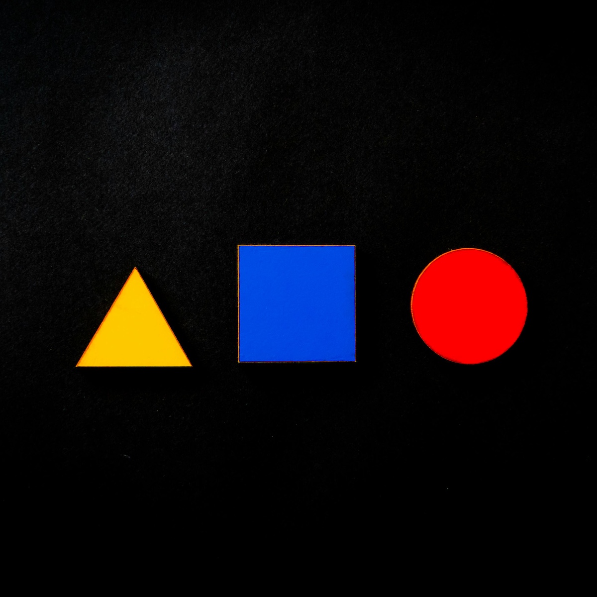
3. The Semiotics of Shape and Color:
This is the study of signs and symbols. Our brains assign inherent meaning to basic forms:
-
Circles, Ovals & Ellipses: Suggest community, unity, love, and connection. (Think: Facebook, Target, BMW).
-
Squares & Rectangles: Convey stability, order, reliability, and strength. (Think: Microsoft, National Geographic).
-
Triangles: Point to power, law, science, and conflict. Direction matters—upward for growth, downward for stability. (Think: Google Play, Mitsubishi).
-
Lines: Horizontal lines are calm and communal; vertical lines are aggressive and strong.
Hypothetical Case Study
“Aegis” – The Cybersecurity Startup
The Situation:
“Aegis” is a new cybersecurity firm entering a crowded, noisy market. Their technology is superior, but their branding is generic: a blue shield and the tagline “Advanced Digital Protection.” They are seen as just another tech company. They need to instantly communicate unbreakable trust and ancient reliability.
The MKUltraOne Strategy: Weaponizing Archetypal Symbolism
We guide Aegis through a rebrand that shifts them from a tech vendor to a mythological protector.
-
Diagnose the Core Archetype: The cybersecurity space is filled with “Sage” archetypes (promising intelligent algorithms) and “Hero” archetypes (promising to slay digital villains). We identify a gap: the “Guardian” archetype—a subset of the Caregiver, focused on protection, vigilance, and unwavering loyalty.
-
Redesign the Symbolism:
-
The Old Logo: A generic, blue, slightly futuristic shield.
-
The New Logo: We design a logo based on the Greek Aegis—the legendary shield of Zeus and Athena, often depicted with a Gorgon’s head (Medusa) to petrify enemies.
-
The Shape: A classic, heraldic shield shape (symbolizing defense and stability).
-
The Central Symbol: A stylized, elegant, and non-threatening Gorgoneion (Medusa head). In mythology, this symbol turned enemies to stone—the ultimate “firewall.” It symbolizes the power to neutralize threats before they can even act.
-
The Color: We move from generic tech blue to a deep, weathered bronze, evoking ancient armor, timeless strength, and proven battle-testedness.
-
-
-
Align the Messaging:
-
Old Tagline: “Advanced Digital Protection” (Features-focused, Sage archetype).
-
New Tagline: “The Ancient Defense for a Modern Threat.” (This directly ties the brand to the mythological symbol and positions it as a timeless solution).
-
The Result: The new branding does the heavy lifting. Before a client reads a whitepaper, they feel that Aegis is ancient, powerful, and protective. The logo isn’t just a drawing; it’s a story. It taps into the Jungian archetype of the Guardian and uses a symbol with deep, Freudian undercurrents of warding off evil. They are no longer selling “cybersecurity”; they are selling a mythological shield for your digital kingdom.
The Strategic Imperative: Audit Your Symbolic Vocabulary
Every element of your brand is a symbol. It’s not neutral.
-
What is your brand’s core archetype? Are you a Hero, a Sage, a Jester, a Creator? Your messaging, imagery, and customer experience must all align with this archetype.
-
What do your shapes communicate? Does your rounded font suggest approachability, or does your sharp, angular logo suggest cutting-edge precision?
-
What story does your color tell? Is your brand red for excitement and passion, or blue for trust and stability?
Conclusion
Know your shape.
Freud saw symbols as a window into the hidden individual mind. Jung saw them as a bridge to the shared human soul. For the marketer, they are both. Symbolism is the most direct path to the customer’s heart because it speaks a language older than words.
Stop telling your customers what you are. Start showing them through the universal language of symbols. Align with an archetype, choose your shapes with purpose, and weave a visual story that allows your customer to see their own ideals reflected in your brand. In the economy of attention, a symbol is the ultimate shortcut.